Which One?
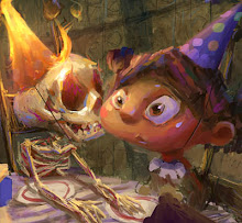
 This started out as a ballpoint sketch, which I then brought into photoshop and worked right into (sort of gave it that Brian Taylor look). I honestly can't decide which version I like better...colour, or monochromatic. Any ideas?
posted by Marco Bucci at 8:54 PM
![]()

30 Comments:
that is a tough choice ~ but, if i had to choose, i'd go color. my reason why you ask? because i love the yellow hue of the moon! ;)
p.s. thanks so much for stopping by my bloggity blog! i'm glad you did since it led me to your page of fantastic art! :)
How funny, I was initially drawn to the monochromatic one. Really though, both are great. Nicely done!
Marco, the color one has more depth and atmosphere to me. Although besides that, the general tone of it doesn't change much from one to the other. I find it to be quite a subtle diference.
I vote for the color though!
Interesting character and situation by the way.
my vote ie for the top one as the coolness ads to the mood in my opinion. Both are fantastic though!
so, my vote goes to the monochromatic one, and I´d try another version, the second one with the yellow hue of the moon...
But, both are very good!
saludos!!
Thanks for the comment.
I just visited your blog. Your artwork is very inspiring :)
By the way, I vote for color.
Hey, great blog and awesome works¡¡¡
sorry, I can't decide which version . I like both versions
:)
(sorry for my english)
Definitely colour, Marco - there's just something about it that's a little added 'wumpf'. Has to do with the...quality? of the tones - brighter, clearer, more interesting. I do like the monochrome too, that would work well for something like, say, a comic version of White Wolf Changeling. But when put up against the colour version, colour wins by a margin!
--Shuku
Looking fat sideways!
Great illustration lightness Marco and yeah i like your study on Morgan Weistling absolutely man!
I think I like the color one better....
In the small one the character looks like he is looking out of the opening in the wall, but if you click on it for the larger view, you see his head turn back towards the viewer. Also the opening combined with the character head becomes another head when the positive/negative space is reversed. Interesting.
beautiful mood, I think I like the bottom one more. Bute it's a tought choice. :)
Brilliant Marco! I love both! My favourite is the colour - though the lighting is slightly more dynamic in the monochromatic one! Tough call!
Ciao Marco!
Thanks for the comment. I try to do some stuff, but you're a real master painter! I've a lot to learn from you. Thanks for sharing.
I prefer the first one: it's a little bit colder.
Ciao
Fab
P.S.: do you speak italian?
Monochromatic!! Monochromatic!!.. It gives more depth to the composition!!.. well, that is my view point.. good job!!
well both looks excellent, maybe it could be more ambitious to catch a great mood in colors... I dunno...
just because you asked, I chose colors (but I also dig the monochromatic! ^^)
I do prefer the top picture, though both look really cool !!
Hi Marco.
Very difficult choice!!! I prefer the monochromatic versione (more atmosphere), but in the end they are awesome!!!!
Laura :)
I actually prefer the monochromatic one myself, but it's a tough choice. The general mood of this image is great.
I like both. But I think I like the colored one. The warms and cool play a little more with that one.
I don't like either. Redraw the whole thing, please.:D
Just kidding:)
Both are great, but if I need to vote, then my vote is on the bottom one.
Ya know I usually am instantly drawn to more monochromatic pieces, but I think I am going to go with the top color version. I agree with marcos mateu - it has a bit more atmosphere to it.
Nice work !
OOH!!! This is awesome!!! I love the mood and the stones around the door way are so well done!!! AWESOME!!
~!WoOtWoOt!~
RoB
I would go with the top one!
Awesome artwork on your blog! Thnx for dropping by. Keep it up!
nice work marco. I like the color version more, but IMO I think the background could be bit cooler (cooler colors, that is). keep it up!
Both are very nice, I think that I like the monochromatic one a little bit better. Great work!:)
I'm liking the warm tones of the lower piece myself. Nice pic.
i'd go for monochromatic. both awesome!
I like the color one because it's just enough color...it still has that monochromatic feel but the color hightens it just enough.!
those are both great. i like the old feel of the monochromatic one, but the color one gives off more of an eerie mood. i guess it depends on what kind of feeling you want people to get out of it.
great job, marco!
Both are very cool, but I think I prefer the monochromatic version.
Post a Comment
<< Home